

TAGGED: edupack, granta, materials, polymers, thermoplastics
-
-
August 16, 2021 at 3:48 pm
harshb
SubscriberHi,
I am trying to plot the following two parameters for all metals, plastics, and composites in the Granta EduPack database:
1) Energy required to melt [kJ/kg] = 8.4*Cp*Tm, where Cp and Tm are specific heat and melting temperature;
2) Energy required to deform [kJ/kg] = 3*(sigma_y + sigma_uts)/density, where sigma_y and sigma_uts are yield and failure strengths
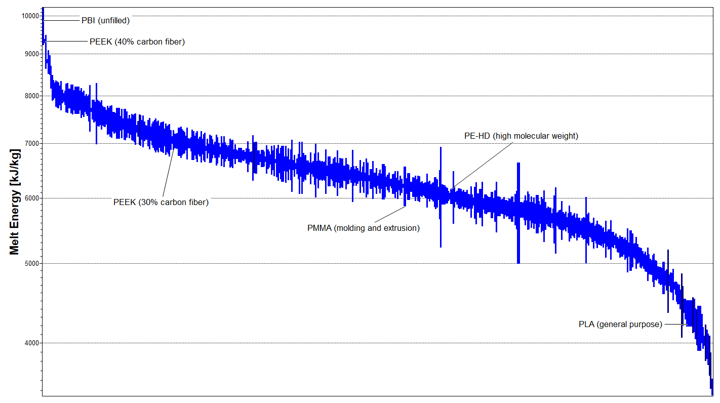
Currently I am able to make 1D charts of these parameters for each material class. Below I show the two plots for all plastics in the database.
August 17, 2021 at 1:54 pmBridget Ogwezi
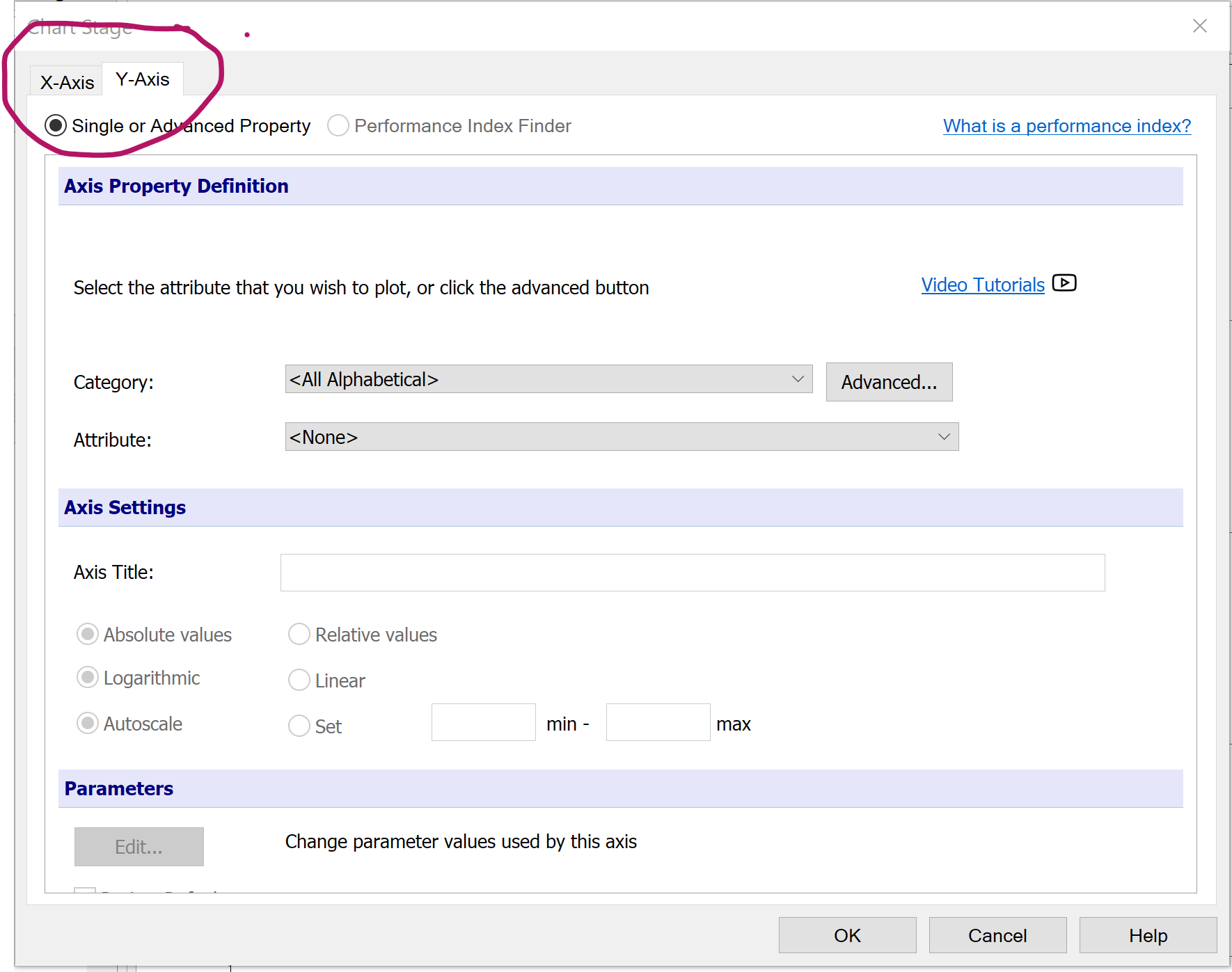
Ansys EmployeeAt the top left hand corner of the chart creating dialogue box, you'll find tabs for the X and Y axis. Click on each of these to select the parameter for that axis. When you've done them both, you can click OK and you'll have a bubble chart.
August 17, 2021 at 2:50 pmSubscriberSo that works for making a bubble chart. But I'm hoping to make a 1D chart with nothing on the x-axis and the both parameters plotted on the y-axis. Something like this:
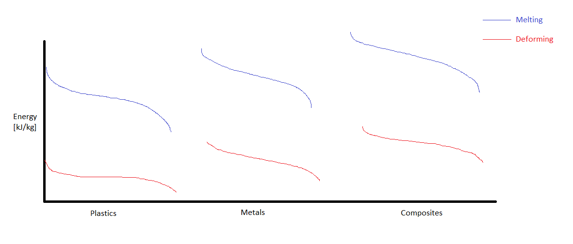 So I want Granta EduPack to output a plot with both the melting and deforming energies on the y-axis for each material class: plastics, metals, and composites. Then I can make this chart by stitching together the three individual plots.
Is this possible with the software? Is there any way to output the numerical values in the database?
August 18, 2021 at 3:29 pmWZhao
SubscriberHello, there,
There is a trick I have used a couple of times for your reference:
Create both charts in edupack with the scales adjusted
Copy both into PowerPoint, set the background to transparent
Overlapping two charts together
I have create a quick example (without aligning scales though, just to show the idea):
Hope this could be of some help.
August 18, 2021 at 3:30 pmSubscriber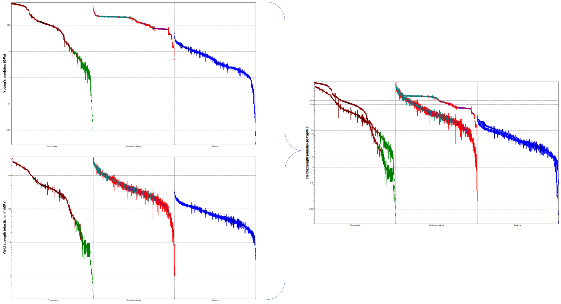 This is a much better figure
August 18, 2021 at 7:22 pmSubscriberThank you WZhao, I will try this.
How did you create the individual plots with composites, metals and alloys, and plastics all plotted on the x-axis?
When I plot the parameter with a custom subset of composites, metals/alloys, or plastics, I only get one material class on the x-axis.
And to match the scales, I should set the same max and min limits for both plots, right?
August 19, 2021 at 10:09 amSubscriberHi You are right about the scales. This is what I have done so far.
As to add different material class on x-axis, I used the Advanced under Chart:
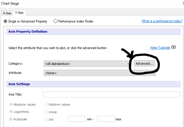 (BTW, the axis setting down there is where I set the scales)
And then if you go to Trees:
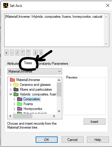
You are then ready to add whatever material class you would like to. I am guessing until now you should be able to create the individual charts as the way you like them.
August 30, 2021 at 2:28 pmDavid Mercier
Ansys EmployeeHi, to get such graphic it is explained above by defining material families you want to show in the tree option of x-axis. And for the y axis limits (min and max, it depends if you show 1 or 2 axis on your graphic. If you keep 1 axis, you have to set the same max and min values for the y-axis. If not it doesn't matter but you have to play on the color for example to differentiate the 2 different plots (eg Young's modulus and Yield strength).
Viewing 7 reply threads- The topic ‘How do I make a chart with multiple material parameters on y-axis?’ is closed to new replies.
Innovation Space Trending discussions
 Top Contributors
-
peteroznewman
 6470
6470 -
scabo
 1906
1906 -
Dennis Chen
 1458
1458 -
javat33489
 1308
1308 -
Shyam Prasad V Atri
1022
Top Rated Tags
© 2026 Copyright ANSYS, Inc. All rights reserved.
Ansys does not support the usage of unauthorized Ansys software. Please visit www.ansys.com to obtain an official distribution.
-


The Ansys Learning Forum is a public forum. You are prohibited from providing (i) information that is confidential to You, your employer, or any third party, (ii) Personal Data or individually identifiable health information, (iii) any information that is U.S. Government Classified, Controlled Unclassified Information, International Traffic in Arms Regulators (ITAR) or Export Administration Regulators (EAR) controlled or otherwise have been determined by the United States Government or by a foreign government to require protection against unauthorized disclosure for reasons of national security, or (iv) topics or information restricted by the People's Republic of China data protection and privacy laws.
