-
-
December 4, 2023 at 3:57 pm
Aras karimi
SubscriberHi to all,
I drew the airfoil pressure coefficient distribution diagram as shown below in Fluent:
Â
Â
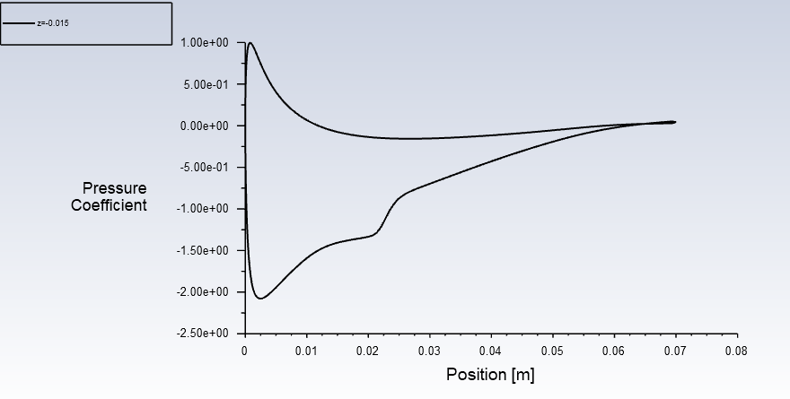
Then I export it as a text file and opened it in Excel software. I drew it in Excel, as shown below, the lines are placed on top of each other, and the irregularity can be seen in it:
Â
Â
What is the problem and what should I do to have a correct and regular curve?
Thanks in advance
Regards
Â
-
December 4, 2023 at 7:12 pm
Federico
Ansys EmployeeHello Aras,Â
the points are not ordered, so I would suggest plotting using only the markers and suppressing the lines.
-
December 5, 2023 at 10:02 am
Aras karimi
SubscriberTo present the results, the pressure coefficient distribution should be plotted by lines.-
December 5, 2023 at 1:15 pm
Federico
Ansys EmployeeWell then you will have to order the points. That is an Excel issue.
-
December 6, 2023 at 9:44 am
Aras karimi
SubscriberThis is not Excel's problem, but Fluent's problem, which does not export the points in order.
In the papers, the pressure coefficient distribution curve is displayed by a line. How did they do this?
-
-
-
December 6, 2023 at 9:54 am
Rob
Forum ModeratorHow did you create the surface you're plotting on? Fluent does export the points in order, and they must be in order or your first image would also be a mess.Â
-
- The topic ‘Pressure coefficient curve’ is closed to new replies.
-
3150
-
1013
-
956
-
858
-
797
© 2025 Copyright ANSYS, Inc. All rights reserved.